Page Summary: Requirements for "Sakai Mobile" broken down on level of perceived level of importance & (my estimated) likelihood of implementation. Based on Quality function deployment methods.
1) Normal mobile functionality
These are items that either exist now, are being worked on, or require are minimal effort.
- QA/Fix issues with the PDA portal, at least on Android/iPhone.
- WYSIWYG should be disabled for Mobile Devices (SAK-18098) - Because currently iPod/iPhone in particular don't support flash or contentEditable, most of the high profile editors won't work. [1] It should just be disabled.
- This doesn't work on Android either, making adding content in most areas impossible
- PDA portal should auto detect and redirect (SAK-18720)
- Perhaps a user preference might be optioned to toggle this behavior (Mobile Device options?)
- The most used tools should all be able to be submitted to and transferred from
- Based on an analysis done at BYU [2] the most highly used tools are
- Resources(85.9%), Gradebook (78.0%), Announcements (68.9%), Email (68.1%), Test and Quizzes (30.1%), Forums (13.5%)
- I believe most Sakai sites would be the same. Maybe Wiki would be as high as forums?
- We also really don't have internal mail, opting mostly to store mail outside the LMS (except for Forums/Email Archive)
- It's possible downloading certain types of content from resources wouldn't do anything. Also, I'm not sure if all devices could upload to resources.
- Based on an analysis done at BYU [2] the most highly used tools are
Other issues, such as the login portal not appearing correct (SAK-18768) and some other stying issues are also being worked on. Each tool may also have some styling issues to get to fit correctly. Overall I would say that the Normal functionality was "good" if PDA portal was the default and WYSIWYG went away.
2) Expected mobile functionality
These are items that are a little more effort but most people want them to work
Some of these were gathered by Daphne in SAK-11568. Some of them are new ideas.
Even after the PDA version of Sakai works, it doesn't work like users expect a mobile application to work.
- The "Home screen" for most mobile apps (Twitter/Facebook) is essentially a time based view of everything that's new for that individual. The main view for Sakai on the web and on the mobile device essentially forces you to "find out for yourself" what's new. (Though a few "My workspace" synoptic tools do aggregate across all sites)
- New items on the wall, New notifications, New friends, New mentions
- Mobile Sakai needs to have a "Home Page" with a "What's New" style feed showing all of the newest items
- This could either be implemented by writing entitybroker feeds for the most highly used tools mentioned in (1)
- This possibly be implemented by hooking into the notification system and capturing all notifications, as this seems to be the most useful data to appear on this feed anyway.
- Even if a notification email is not sent, it could appear on this page
- There should be some type of WYSIWYG editor on the text areas
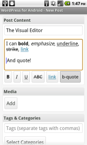
- Wordpress recently rolled out some type of WYSIWYG for their mobile site. [3] Perhaps this is more of a 'wait and see' than implement, but either way the mobile WYSIWYG will have to have much less buttons than the full blown one because of screen 'real estate'
- Wordpress recently rolled out some type of WYSIWYG for their mobile site. [3] Perhaps this is more of a 'wait and see' than implement, but either way the mobile WYSIWYG will have to have much less buttons than the full blown one because of screen 'real estate'
3) Exceptional mobile functionality
These are items that would be great to have but mostly dreams and this point. Theyt might work in 'some' web site now (gmail), or are available in a coming spec (html5)
These items are pretty unlikely for Sakai 2 without a large effort (GSoC or significant FTE committed)
Fill this in more later.
- Being able to take the browser offline. Using HTML5 Web Storage to locally cache data. Similar to what many mobile apps do (like GMail). Then you don't have to maintain a persistent data connection. Problems with invalidation and new data. Would probably require entitybroker feeds to exist and UI's to be rewritten in javascript.
- A working back button.
- On both Android and iPhone the back button is even more important than the browser. It bacically undoes whatever the last action was, whether that is removing a dialog box, going back to the last screen. Incorporating consistant back button behavior into mobile navigation would be great.
- Supported integration for conferencing/chat tools, link them up to classrooms.
- It seems ilke big blue button is getting the most support, it would be great to be able to switch to that and use it. This is quite a ways down the road though because of the lack of Flash on iPhone/iPod, and the HTML5 spec support for cameras being a little ways off.
1. http://cksource.com/forums/viewtopic.php?f=6&t=18317
2. http://www.slideshare.net/jonmott/eli-2010-the-genius-of-and-the-cms-the-oln-2958774 (Slide 11)
3. http://www.blogherald.com/2010/07/07/wordpress-ignores-iphone-updates-android-app/
