Guide to creating skins for Sakai 2.9 and Sakai 10
This guide will help you tailor the Sakai 2.9 appearance. It will walk you through the process, listing out the options, pointing out the decisions you will need to make to better fit the needs of your institution.
Although presented as a skinning guide, since what you want to use and how you want to use it is also in the mix, we will be covering a bit of what functionality is involved. Instead of a separate guide for Sakai 10 - will add an addendum for that version.
Sakai 10 Addendum
Incorporate the changes below into your skin. Another alternative is to just proceed as below for 2.9 by copying the Sakai 10 /neo-default skin and editing it. This may be more attractive option if your 2.9 skin is a minimal departure from the default 2.9.
Note: If you are upgrading from 2.8 or 2.7 to 10, just use the 2.9 guide. The addenda will not be needed.
Sprites
The biggest change involved changing the individual tool menu definitions to use sprites. In order to do this the portal markup needed to be changed. See the Subversion tab at:
| Jira Legacy | ||||||
|---|---|---|---|---|---|---|
|
The easiest possible thing may be to apply the /reference diffs to your skin, or maybe even do it manually. They are extensive, but well defined/contained. Not making these changes will result in strange looking menus.
Other minor issues
Some of these have made it into the 2.9.x branch, so you may have already addressed them. Again - take a look at the subversion tab to see what changed.
| Jira Legacy | ||||||
|---|---|---|---|---|---|---|
|
| Jira Legacy | ||||||
|---|---|---|---|---|---|---|
|
| Jira Legacy | ||||||
|---|---|---|---|---|---|---|
|
| Jira Legacy | ||||||
|---|---|---|---|---|---|---|
|
| Jira Legacy | ||||||
|---|---|---|---|---|---|---|
|
| Jira Legacy | ||||||
|---|---|---|---|---|---|---|
|
| Jira Legacy | ||||||
|---|---|---|---|---|---|---|
|
| Jira Legacy | ||||||
|---|---|---|---|---|---|---|
|
| Jira Legacy | ||||||
|---|---|---|---|---|---|---|
|
| Jira Legacy | ||||||
|---|---|---|---|---|---|---|
|
Finally, the default Sakai 10 skin is a flat skin with no gradients. To take a look at the small changes that make up this see:
| Jira Legacy | ||||||
|---|---|---|---|---|---|---|
|
| Jira Legacy | ||||||
|---|---|---|---|---|---|---|
|
| Jira Legacy | ||||||
|---|---|---|---|---|---|---|
|
| Jira Legacy | ||||||
|---|---|---|---|---|---|---|
|
Sakai 2.9.2 Addendum
A wrapper for single column tools was added for 2.9.2 to avoid float drops when using the portlet version of the web content tool.
<div id="innercontent">
| Code Block | ||||||
|---|---|---|---|---|---|---|
| ||||||
/* second wrapper for content - needed by SAK-12563 */
#innercontent {
    float: left;
    width:100%
} |
Sakai 2.9.1 Addendum
There were several changes to the markup and/or the skin for 2.9.1, as well as some things I ran across when I was making a skin for Michigan. These will be listed here. I will get to them 05/25/13.
Old portal (defaultskin)
You may have excellent reasons to choose the old portal that will run in 2.9 with no problem. If so, please refer to the guide for 2.8 [1]. The good news is that not much has changed in 2.9 for defaultskin, so there will be almost nothing to adapt from your 2.8 installation, and only a little from 2.7. The bad news is that little has changed.
New portal (neoskin)
The new portal represents a substantial departure in Sakai. You will not be able to edit your 2.7 or 2.8 skin and produce a 2.9 neo portal skin without going mad. The good news is that the 2.9 neo portal is the simplest, best documented and most skinnable portal yet.
Neo portal functional choices
If upgrading from 2.7 (or want to reexamine the choice you made for 2.8) these are some things that have an impact on appearance.
- Enable the role switcher? For what types of sites? For what roles? What values? [2]
- Enable the timeout alert? With what time value? [3]
- Enable collapsible side menu? [4]
- Categorized “more sites” drawer? or flat?
- Portal chat? Not enabled in 2.9 by default.
Features that may make it into 2.9 or that you may consider merging in.
- Portal tutorial [5]
- Direct link and URL shortener
Skin choices
- One skin or several? If several you may consider having a primary theme, and others that are just variations.
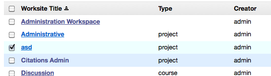
- Need to differentiate site types? Do you have courses, projects, tutorial, and/or other site types and need to subtly make them different? [6]
- Do you want to make the gateway quite different? [7]
- What login will you be using? Login internal to Sakai, some CAS login? Both?
Getting started
Get a UX person with a strong practical design experience to work with! Then sequester yourselves and produce some options that your stakeholders can check out. Do not get committees involved, life is short (and ars longa). Here is a simple guideline: everything is skinnable, but some things are easier than others. We will get to this soon.
The mechanics
If you are primarily a front-end developer download the demo version of 2.9 that you can download, unzip and run with a few clicks. To get the demo version – go to the release page for Sakai 2.9 and download and unpack it. As of this writing there is no demo version yet because it has not been released - will update this when that happens.
Start the demo server, this will expand the files we are interested in so that you can work with them.
The skin files are contained in <server folder>/webapps/library/skin:
Skins for defaultskin rendering engine
- default (default skin for defaultskin rendering engine)
- default-horiz
- examp-u
- gen-u
- oae
- rtl
- some-u
- ux
Skins for neoskin rendering engine
- neo-default (default skin for neoskin rendering engine)
- neo-default-horiz
- neo-default29 (deprecated)
- neo-examp-u
- neo-gen-u
- neo-oae (for use in hybrid environments with OAE)
- neo-rtl
- neo-some-u
- neo-ux (deprecated)
and an images folder, as well as tool_base.css
Of the skins for the neoskin rendering engine neo-default29 and neo-ux are not supported and are included just for historical reasons. Note: The default and neo-default skins are required for some things to function correctly (x-login, site info display), do not delete.
Each skin has the following structure.
 skin_name
images (folder containing images used by the skin)
portal.css (styles the portal – will be doing most work here)
pda.css (for the mobile portal)
tool.css (styles the tools, overriding or filling gaps in tool_base.css)
access.css (no need to bother with this) [8]
portalchat.css (no need to bother with this) [9]
Choosing a skin to start of from
- Browse to your server at http://localhost:8080/portal, login as admin (pwd: admin).
- Create 7 sites.
- Go to Administration workspace and in the Sites tool given them all different skins - use the list below, but omit the neo- prefix - the portal will add the correct link because you are using the neo portal.
Available and supported skins are (use text below):
- neo-default
- neo-default-horiz
- neo-examp-u
- neo-some-u
- neo-gen-u
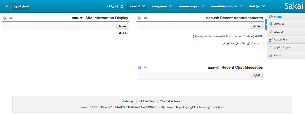
- neo-rtl (if you are working in a right lo left language context)
- neo-oae
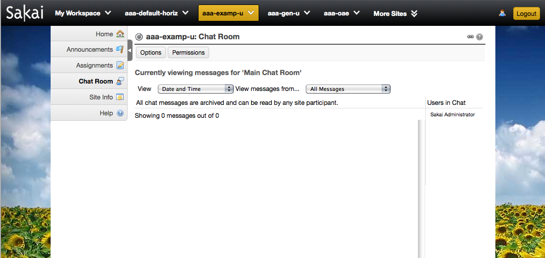
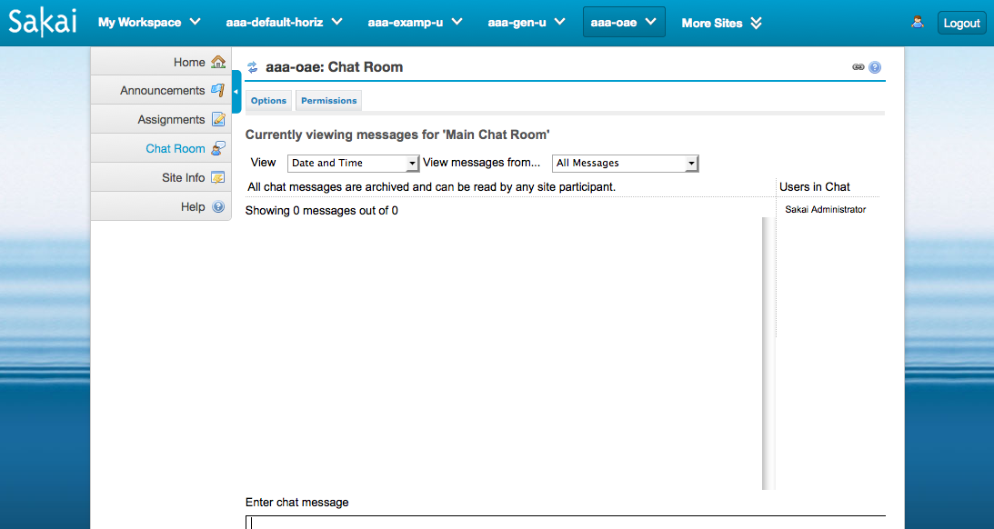
neo-default
| neo-default-horiz
|
|---|---|
neo-examp-u
| neo-gen-u (embarrasing!)
|
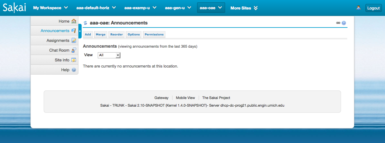
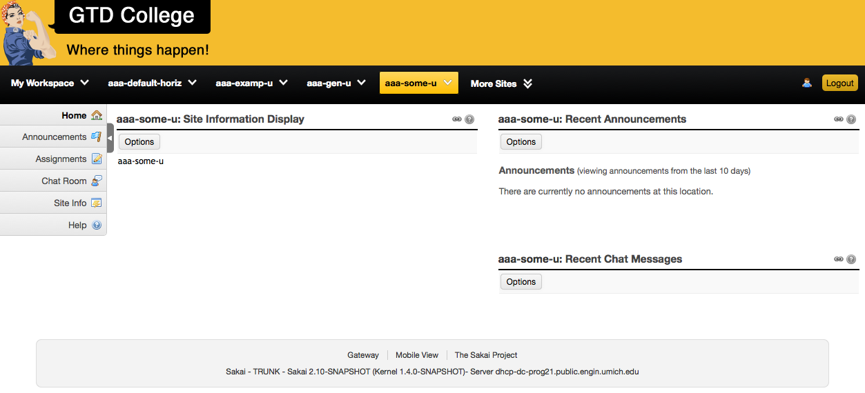
neo-oae
| neo-some-u
|
neo-rtl
|
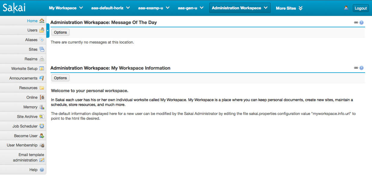
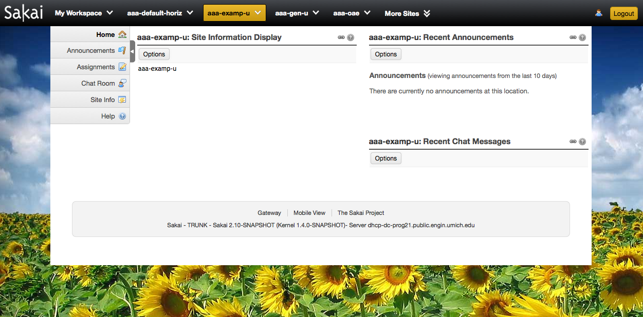
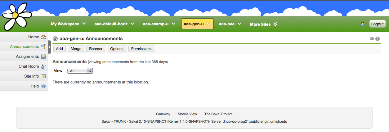

Now you can navigate to the different sites and examine the different skins. Some may be closer to your design than others. Choose the one that seems like the best candidate. Since the portal changes quite a bit depending on whether you are logged in or not you should check it out as a “not logged in” user:
- go again to the Admin Workspace
- go to Sites
- find the!gateway site and click on the link
- give it the skin you are checking out
- log out and examine the logged out page with this skin.
Setting up a new skin
For simplicity’s sake, we are going to assume you have selected neo-default as the skin you are going to use as your base.
- Copy neo-default skin folder, rename. Make sure your new skin folder name has a “neo-“ prefix.
- Stop the server
- Edit <your_server_location>/sakai/sakai.properties
- Search for word “skin”
- Make sure that skin.default=<your_new_skin_name minus the "neo-" prefix>
- Restart the server – now all sites and any new sites will use your skin (change the!gateway site to it if you did it following instructions above)
Some useful tools
- Firebug: essential [10]
- CSS Editor (syntax coloring, auto formatting, syntax completion, something like Aptana [11])
- CSS validator [12]
- Gradient [13], box shadow [14] and border-radius [15] generator.
The basics (about 1-2 hours all told, really)
We are going to add a few logos, change the palette. Line numbers and affected CSS of neo-default/portal.css are included. The selector is also included so that you can search on it.
Logos
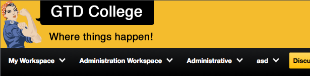
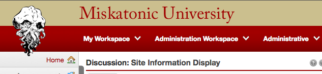
The logos in your new skin display at the top left both in the gateway and the logged in portal (below the logo on left, over a gradient for the navigation bar, and at right the current site tab):
Create a logo with a transparency (png recommended). Call it logo.png, put in your_skin/images.The original logo.png is 80 wide, 43 high. The bounding box is 100 x 50. You can tweak both dimensions a little bit as needed. The CSS for this starts in line 132 of neo-default/portal.css for the gateway:
| Code Block | ||||||
|---|---|---|---|---|---|---|
| ||||||
#headerMin #mastLogo {
    display: block;
    background-image: url(images/logo.png);
    background-repeat: no-repeat;
    background-position: 8px 4px;
    float: left;
    width: 100px;
    height: 50px;
} |
and in line 330 for the logged in user:
| Code Block | ||||||
|---|---|---|---|---|---|---|
| ||||||
#linkNav ul.topnav {
    list-style: none;
    padding: 8px 0 5px 155px; /* matches the width of the toolMenu*/
    margin: 0;
    width: 100%;
    background: transparent url(images/logo.png) 8px 4px no-repeat;
} |
Palette: portal
For the palette in general there are a number of places in neo-default/portal.css that you need to touch. A lot of them could have been grouped/refactored, but were left duplicated in the default for clarity. Below only those places that you need to change because they play nicely with the Sakai palette but may not be too complimentary with yours. You can make more changes if you want of course.
Top bar is a gradient defined in lines 98-107:
| Code Block | ||||||
|---|---|---|---|---|---|---|
| ||||||
#headerMax, #headerMin {
    background: #009DCE;
    background: -moz-linear-gradient(top, #009DCE 0%, #007EA5 100%);
    background: -webkit-gradient(linear, left top, left bottom, color-stop(0%,#009DCE), color-stop(100%,#007EA5));
    background: -webkit-linear-gradient(top, #009DCE 0%,#007EA5 100%);
    background: -o-linear-gradient(top, #009DCE 0%,#007EA5 100%);
    background: -ms-linear-gradient(top, #009DCE 0%,#007EA5 100%);
    background: linear-gradient(top, #009DCE 0%,#007EA5 100%);
    border-bottom: 1px solid #007194;
} |
...
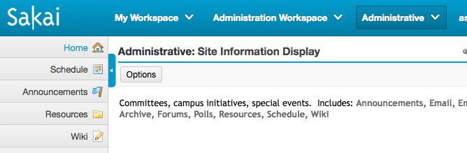
Current site tab (the "Administrative" button in above screenshot) is defined in 357-369.
| Code Block | ||||||
|---|---|---|---|---|---|---|
| ||||||
ul.topnav li.nav-selected {
    background: #008DB9;
    background: -moz-linear-gradient(top, #008DB9 0%, #007194 100%);
    background: -webkit-gradient(linear, left top, left bottom, color-stop(0%,#008DB9), color-stop(100%,#007194));
    background: -webkit-linear-gradient(top, #008DB9 0%,#007194 100%);
    background: -o-linear-gradient(top, #008DB9 0%,#007194 100%);
    background: -ms-linear-gradient(top, #008DB9 0%,#007194 100%);
    background: linear-gradient(top, #008DB9 0%,#007194 100%);
    border: 1px solid #005A76;
    -moz-border-radius: 3px;
    -webkit-border-radius: 3px;
    border-radius: 3px;
} |
Aside from the gradient you may want to supply a border that matches it. The same border color can be used for the tab hover rendering beginning in line 350:
| Code Block | ||||||
|---|---|---|---|---|---|---|
| ||||||
 ul.topnav li.nav-menu:hover, ul.topnav li.more-tab:hover {
    border: 1px solid #005A76;
    -moz-border-radius: 3px;
    -webkit-border-radius: 3px;
    border-radius: 3px;
} |
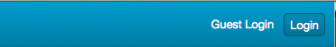
Login form elements also make use of gradients in 196-210:
| Code Block | ||||||
|---|---|---|---|---|---|---|
| ||||||
 #loginLink1, #loginLink2, form#loginForm input#submit {
    display: block;
    border-radius: 5px;
    padding: 4px 6px;
    text-align: center;
    text-decoration: none;
    background: #008DB9;
    background: -moz-linear-gradient(top, #008DB9 0%, #007194 100%);
    background: -webkit-gradient(linear, left top, left bottom, color-stop(0%,#008DB9), color-stop(100%,#007194));
    background: -webkit-linear-gradient(top, #008DB9 0%,#007194 100%);
    background: -o-linear-gradient(top, #008DB9 0%,#007194 100%);
    background: -ms-linear-gradient(top, #008DB9 0%,#007194 100%);
    background: linear-gradient(top, #008DB9 0%,#007194 100%);
    border: 1px solid #005A76;
} |
and their :hover states in lines 214 & c.
| Code Block | ||||||
|---|---|---|---|---|---|---|
| ||||||
#loginLink1:hover, #loginLink2:hover, form#loginForm input#submit:hover {
    background: #007194;
    text-decoration: none;
} |
Again – replace colors as needed, with a gradient, a flat color, or background images. This controls the login elements, no matter what login configuration you are using.
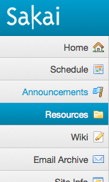 | The tool menu is very neutral color wise. The exceptions here are the hover state and the “current tool” state The first one is a gradient value for the following selector in lines 759-779:
The “current tool” is just a color value for the selector in lines 731-734
|
Note: the tool menu can also be minimized, the “current tool” rendering is at lines 1546 & c with the selector
| Code Block | ||||||
|---|---|---|---|---|---|---|
| ||||||
.sakaiMinimizePageNavigation #toolMenu li.selectedTool a, .sakaiMinimizePageNavigation #toolMenu li a:hover, .sakaiMinimizePageNavigation #subSites li a:hover,.sakaiMinimizePageNavigation #toolMenu li a:focus, .sakaiMinimizePageNavigation #subSites li a:focus {
    background: #9cd1e8;
    /*.....*/
} |
You will also need to touch the buttons on the “more sites” tray. To see this you will need to create at least 10 sites. Easiest way to do this is to go to one of your sites and Site info > Duplicate and then visit the “More sites” tray.you will then see something like this:
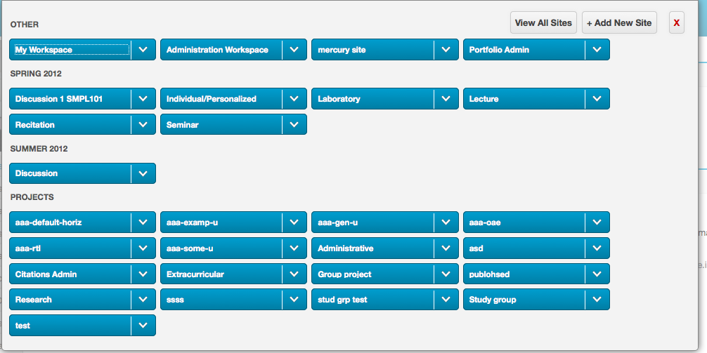
The site button rendering is defined in lines 565-585 of this selector:
ul#otherSiteList li, ul.otherSitesCategorList li {
The hover state of the “Other sites” menu (that contains the View all Sites, Add New Site) is a Sakai blue that you can change in lines 540-542 for this selector:
#otherSitesMenu li a:hover, #siteStatus a:hover, #siteStatus a:focus {
You will want to change the site status box and children, available in lines 822-843. For the following selectors:
#siteStatus {
#siteStatus a {
They affect color of text and color of link in the capture below:
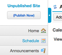 | The “Unpublished Site” text and the “(Publish Now)” link appear on unpublished sites. To display, go to a site, thenSite info > Manage Accessand change to leave as draft. Notice the minimize control on the left, also a nice Sakai blue. The easiest thing to do would be to open it in Photoshop and grey-scale it. Also – if you look at the above image you will see the double arrow reload icon. That and the help icon that are displayed in the tool title bar are images that live at |
Finally, there is the tool title. In the default skin there is a thin Sakai blue line at the bottom.

that you can change to suit in lines 51-62:
#col1of2 .portletTitleWrap, #col2of2 .portletTitleWrap {
#col1of2 .portletMainWrap, #col2of2 .portletMainWrap {
#col1 .portletTitleWrap {
And that is it for the portal!
Palette: mobile portal
Sakai has a simple mobile portal you can see if you go to:
http://localhost:8080/portal/pda
The palette there is fairly simple. Let’s take a look. All line and selector references are to neo-default/pda.css
...
The only three areas of concern are:
- the top bar gradient blocked in yellow at right (lines 39 &c, 259 & c)
...
The footer (scroll down to bottom to see) looks like the header in neo-default, but you can make it different - see lines 230 &c and 355 &c.
#pda-footer {
2. The regular buttons (blocked in red), lines 90 &c,
#pda-portlet-menu li.loginLink,#pda-portlet-menu li.logoutLink, #switch-link-w,.helpLink {
3. The only tricky one is the back button blocked in purple at right. What I did was screenshot a regular button, Photoshop liquefy the left edge to make it pointy, slice the resultant image in three, making them backgrounds to the<li>, the<span>and the<a>that altogether make up the button. Take a look at the CSS in lines 68-89. Pretty horrible!
Important note: the pda.css serves two types of clients, small mobile webkit, and everything else. The experience of an iPhone or an Android default browser will be quite different than the one of an iPad or a regular browser. Taking care of the three items above will do the job - but do test with
- any/all of the browsers Sakai tests on
- an iPhone, Android device, or iPhone/Android emulators
Palette: tools
The default palette for the tools has been kept fairly neutral as well, but there are some things you may want to touch. The following references neo-default/tool.css
Standard links (lines17-30).
A-historical links (lines 42-49) - these are links that have an href="#" so click one and all look visited. For ever. So we male a:link and a:visited the same color:
.specialLink a:link, .specialLink a:visited {
.specialLink a:hover {
Item links (76-90 – create an announcement and see the list):
.itemAction a, .itemAction a:link {
Tool toolbar links
.navIntraTool a, .navIntraTool a:link { (lines 109-119)
and
.navIntraTool a:link:hover, #actionToolbar a:link:hover { (lines 702-704)
You might want to change the color of links that appear in table headers as well. In neo-default they are black (see below). If so, the relevant CSS is here:
| Code Block | ||||||
|---|---|---|---|---|---|---|
| ||||||
.listHier th a:link, .listHier th a:visited {
    color: inherit;
    text-decoration: none;
} |
as well as the table header sorting link hover (which is Sakai blue in neo-default)
| Code Block | ||||||
|---|---|---|---|---|---|---|
| ||||||
.listHier th a:hover {
    color: #a00000
} |
Finally – there are some background colors that may not marry well to your institutional palette:
Table row treatments:
The light blue for a selected row is at lines 396-398:
| Code Block | ||||||
|---|---|---|---|---|---|---|
| ||||||
tr.selectedSelected {
    background: #eff
} |
the darker blue hover is at lines 334-336:
| Code Block | ||||||
|---|---|---|---|---|---|---|
| ||||||
table.lines tr:hover {
    background-color: #DEEEFF
} |
Finally, button types of things have the Sakai color as well in the labels. To change this, edit the declaration of this selector at line 1155:
input[type="submit"], input[type="button"] {
. . . . . . .
color: #2683BC !important;
And that is it! It will be a good idea to spend a few hours poking around to see if these few changes meet your needs, and where you see something you feel must be changed, locate where in the CSS it needs to change with Firebug help. Keep in mind that you have 3 areas with 3 sheets: portal (portal.css), tool (tool.css) and mobile (pda.css)
Getting more involved
Adding a mast head
If your design needs a masthead you can add it.
There are many different canvases that can carry this. If we take a look at the above example (neo-some-u/portal.css) you can see that the Rosie the Riveter image and the text comes from lines 138-146.
| Code Block | ||||||
|---|---|---|---|---|---|---|
| ||||||
 #mastBanner {
    background: url("images/logo_back.png") no-repeat scroll 0 0 transparent;
    float: left;
    height: 95px;
    width: 390px;
}
#mastBanner img {
    display: none;
} |
In the default skin #mastBanner is hidden. Here it is displayed, given a height and a width and a background image referenced.
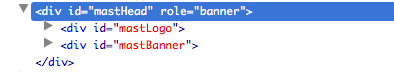
The parent container #mastHead (lines 117-122) sets up the background color and provides a height (the children are all floated, so an explicit height is needed for the parent container):
| Code Block | ||||||
|---|---|---|---|---|---|---|
| ||||||
#mastHead {
    clear: both;
    display: block;
    background: none repeat scroll 0 0 #F4BC2D;
    height: 95px;
} |
In this horrid example from neo-default-horiz/portal.css we are using two canvases (#mastLogo and #mastBanner) that were hidden in the default skin; here is a screenshot from Firebug displaying the structure:
#mastLogo produces the Cthulhu head:
| Code Block | ||
|---|---|---|
| ||
#headerMax #mastLogo {
    display: block;
    background: transparent url(images/logo.png) 4px 0px no-repeat;
    position:absolute;
    top:10px;
    left:20px;
    width: 100px;
    height: 100px;
} |
Note the absolute positioning that allows the unearthly tentacles to drape over the navigation bar menacingly.
#mastBanner produces the mythic university text:
| Code Block | ||
|---|---|---|
| ||
#mastBanner {
    width: 450px;
    height: 100px;
    float: left;
    margin-left: 0px;
    background-image: url(images/banner.png);
    background-repeat: no-repeat;
    background-position: 0 15px;
} |
Like the Rosie the Riveter example, the parent of both these blocks needs to have a height equal to the highest of them, because they are both floated.
Both neo-default-horiz and neo-some-u skins have different mast-head treatments depending on whether the user is logged in or not. This is achieved by contextualizing #mastHead and it’s children – are they contained in not logged in (#headerMin) or logged in (#headerMax) headers? This allows you to alter the graphics, dimensions, anything depending on the logged in state.
Adding a background image
You can add a background image to the portal. Take a look at neo-examp-u and neo-oae below. In the first the image is a large slab, in the second it is a thin strip that gets repeated horizontaly.
In both cases the image is the background of the body (lines 3 &c of neo-oae/portal.css):
| Code Block | ||||||
|---|---|---|---|---|---|---|
| ||||||
 body.portalBody {
    width: 100%;
    padding: 0;
    font-family: 'Helvetica Neue', Arial, sans-serif;
    font-size: .8em;
    margin: 0;
    background-color: #093b52;
    background-image:  url(images/page_bg_water.jpg);
    background-repeat:repeat-x;
} |
and then setting margins on the #container (lines 25 & c of neo-oae/portal.css):
| Code Block | ||||||
|---|---|---|---|---|---|---|
| ||||||
 #container {
    background: #fff;
    margin: 0 100px;
    -webkit-box-shadow: 0px 2px 5px rgba(50, 50, 50, 0.25);
    -moz-box-shadow:  0px 2px 5px rgba(50, 50, 50, 0.25);
    box-shadow: 0px 2px 5px rgba(50, 50, 50, 0.25);
    border:1px solid #ccc;
   -moz-border-radius: 0 0 10px 10px;
   -webkit-border-radius: 0 0 10px 10px;
   -khtml-border-radius: 0 0 10px 10px;
    border-radius: 0 0 10px 10px;
} |
The base Sakai portal layout is fluid. So given the prevalent screen size plus the fact that users can minimize the tool you can probably use pretty wide margins – but keep an eye on some tools that need a bit of width (chat and resources come to mind).
Finally – everything in the portal and most everything in the tool is addressable. Use Firebug to see what defines what and then change it. As an example of an extreme makeover take a look at the neo-rtl skin. Go to the admin workspace, choose Sites and add that skin to a site so that you can check it out. In any case, here is a screenshot. The colors/images are the same, but everything has been moved around.
Other things of note
Some features may be enabled but you will not be able to see them. The default rendering for these features is pretty neutral, but in case you want to take a look and maybe change here they are listed.
Time-out alert
This gets displayed to users who are about to loose their session. It looks like this alarming thing:
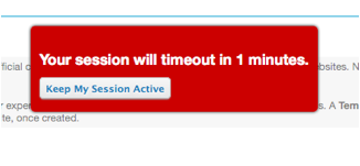
And you can change it in lines 1568 &c on this selector in neo-default/portal.css:
#timeout_alert_body {
No javascript alert
This is a message that gets displayed to users that do not have Javascript enabled. It gets displayed fixed at the bottom of the viewport so that it is visible always but does not cover anything else.
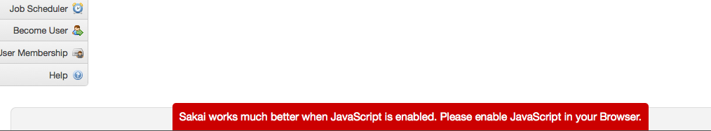
To change it (this is on neo-default/portal.css) it is in lines 1644-1659 on the selector:
#portal_js_warn {
Jump-to links visible on focus
Sakai has always had jump-to links that allow a user to hop to specific parts of the portal via acceskeys. In order to help users who are not visually impaired and use the keyboard as the primary navigation device these are now visible when the user tabs into them.
In the neo-default skin these display over the logo:
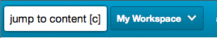
But you can get creative: http://screencast.com/t/SmOGcMzW
The links are defined in lines 1459 & c. on this selector in neo-default/portal.css:
#skipNav a.internalSkip:focus, #skipNav a.internalSkip:active {
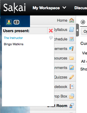
Presence Window and icon
If your installation is going to use Presence (displays who is in a site), you might want to touch that as well – the icon/control that toggles the window is pretty hidden in neo-default skin at bottom right. With absolute and fixed positioning you can move them anywhere in the portal where they will not cover anything else up.
As an example, make sure presence is enabled (display.users.present=true in sakai.properties) take a look at a site with the neo-examp-u skin. Go there as two different users in two different browsers. You will see:
and if you click on the guy icon you will see the following ("The instructor" is a link to the chat room because The Instructor is in a chat room):
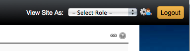
 | Below you can see that the control icon to display the Profile/Preferences/Add new site can be changed. In this case we have combined a cog and the little person to indicate that this is both a link to settings and a link to profile.
To see what changed specifically to do this, view the Subversion commits for
|
That is about it. More could be said – but hopefully this will get you started. If you have any questions please post to sakai-dev@collab.sakaiproject.org. If you discover any bugs or have suggestions, create a Jira with reference (and/or portal) as the components.
[1]) Skin doc for 2.8:
https://source.sakaiproject.org/svn/reference/tags/sakai-2.8.2/docs/architecture/sakai_skin.doc
[2]) https://jira.sakaiproject.org/browse/SAK-7924
[3]) https://jira.sakaiproject.org/browse/SAK-13987
[4]) https://jira.sakaiproject.org/browse/SAK-19193
[5]) https://jira.sakaiproject.org/browse/SAK-22243
[6]) http://gonzalosilverio.wordpress.com/2008/06/28/corners-of-sakai-2-skinning-site-types/
[7]) The gateway is just a site. You can create a skin for just the gateway if needed.
[8]) Styles the access view of resources
[9]) Styles the portal chat
[10]) http://getfirebug.com/
[11]) http://www.aptana.com/
[12]) http://jigsaw.w3.org/css-validator/
[13]) http://www.colorzilla.com/gradient-editor/